I have decided to look at a range of existing branding to get an overall idea of the techniques that are used to give a company or business a face or an identity that stands out amongst the crowd.
The image blow shows how the brand name and logo can be printed across two different aspects of print based branding for example, Business cards and letterheads.
The image below shows how a constant colour scheme can be effective in this case, the items may not even be part of the brand its self. However the colour scheme its self can bring products together to give the whole brand an identity.
In my opinion i personally love black and white colour selection, as it keeps the design simplistic however in my case i do not believe this is going to be effective in communicating a message of high quality vision the colours must be bold and must stand out.
I love the way this design below applies the logo across a large range of of other products i feel this is effective due to the fact the logo stays around the same size the whole way through rather than many variations in size I will think about using this when applying my branding.
Looking at brand Specifications_
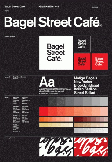
I love how this design below has completely simplified the whole idea of specification book, and instead condensed this information, and created a poster. I feel this a great technique but i will have to think about how i can get around this so that the product is transportable.
In this example i don't really think that the stock considerations have been thought about for example, towards the top of the photograph a beautiful stone coloured stock is used then this changes tot the left and then again it changes tot a card like stock_ in my opinion this creates to many variations within the brand.
I feel that keeping the stock considerations simple is a great technique of incorporating aspects of the branding, for example look how the image below shows the spot colour of the blue on the back of the letterhead i feel this is a great way of making sure that brand flows but ensuring that the products are not over crowded with aspects of the design.
The images below show how a colour can be used across a range of products, to give a strong brand identity this is something that i must work and develop to achieve a strong brand identity.


No comments:
Post a Comment