Saturday 22 October 2011

5 Effective questions to ask when in a crit:


Critique Exercice:


We where asked to bring in examples of work that we found inspirational. It must be the work of a type designer, illustrator, logo and photography:


Type Designer : Max meidinger - Helvetica. The typeface is sans serif typeface i love the typeface becasue it conveys no emotion or feeling it is default it communicates what is in then words content.


Illustrator: Mario Hugo: For the way he combines surrealist ellements with his illustration and how he renders the shapes to give the illustration depth. i feel he achieves this so well due to the use of pencil as media:


logo:


Photography:


What is a Crit?

  • Critical analysis of someones work
  • Stating the positive points and points of improve of a piece of work, using the feedback as an opportunity to give advise on how they could improve
  • A chance to see if the message you aim to put across is communicating as effectively to everyone else
  • Giving and receiving Constructive criticism 
  • Somewhere to share ideas, using peers works as inspiration and a chance to compare 

Why do we crit?

  • To receive the opinions and constructive criticism of my peers to develop myself as a designer   
  • Gain a better vocabulary associated to the design industry
  • To Receive feedback on what changes you could make to improve, by revisiting these points I will become a much more effective designer
  •  To improve my presentation skills when communicating my design to an audience


D.I.E.T. 
Rules of how to crit:
  • Describe
  • Interpret
  • Evaluate
  • Theorise

Questions to ask in a crit:


Questions:
- What target audience is this directly aimed at? 
- What was your main inspiration when creating your design?
- Are there any messages given off by the colour choice/ any colour psychology involved?
- How would you improve your designs if given the chance? 
- What is the design communicating? 
- In what context would the design be put in?  

Wednesday 19 October 2011

Lecture 3: Graffiti and street art -

Grafiato - Scratched.


- Cares at la scaux - France - Cave wall Paintings.
- Discovered in 1940 by four teenagers.
- Depicting Scenes 


Ancient Roman Graffiti - Pompeii 


Political use of graffiti:


- Killroy/ Chad - WWll - Memorial washington DC. UK "Slogan What.. No?
- Paris May 68' - Largest Strike - 11 million workers. 
- Paris 68' - Graffiti Posters and newspapers poems of the events.


1970s New york.
-Spray can graffiti - Hip Hop culture - Making the language of the streets visible. 
- Announcing presence "we will not be ignored"


Jon Narr Photographer - 1973
Samo - same-oh Same - Same old shit 
- Private joke
- Death of Samo - 1979


Neo Expressionist Painting.
- Warhol and Basquait - General Electric with waiter 
- 1984 - one of americas largest company.


Keith Hartley - Radient  Baby


1981 sketches first chalk drawings


Popshop art - selling t shirts, toys, posters baring signatures, images - celebrity hang out.


John Feckner - Broken Promises, 1980


Jenny Holzer - Times square - Abuse of power came as no surprise.


Video game culture - comment on the lack of availability of brands and technology in the western block


TATS CRU - 1997 for coca cola.


"Bomb the world" 


2000 Graffiti in video games 


Invader - French artist - 1969 - tiles  - pixel like.


Conceptual elements: Points on the map represent the form of a space invader.


Re emergence of street art.


Banks - kate moss
Shepard Fairy - 2008


Parisian photographer JR, Favela morro da provienda - Rio 2008 


Blu (Italy) and OS Gemeos (Brazil) Lisbon 2010


123 KLAN (France) create logo designs for the likes of Adidas nike.


Paul curtis ( MOOSE) reverse graffiti 


Sam 3 spain, Murricia 2010 all ideas in silhouette - city as a stage


VHILS Amsterdam Red stickers round a natural hole in plaster.


Diva - Brooklyn 


Fafi - France.


Miss Van - sexual


Swoon - Educated artist, Female  


Art of resistance.


Further reading:


Parry willian, 2 010 against the
Graffiti woman

PROVERBALLY YOURS// MESSAGE & INTERPRETATION: Research on layout, Typeface and Colour Psychology


I have looked into a few styles of typographic layout, and have then selected the one style that I feel is most effective for the style of poster design I aim to Create, I have explained the meaning behind this below.


The use of white space gives off a calming message/feel tho the viewer which in this context I feel will be highly effective. As the poster designs I am aiming to create are there to calm the students into working into further education.


Type that is right aligned to me gives the design a sense of importance almost grasping the attention of the viewer i feel if i combine this with the correct typeface this could be effective.

Typeface: My initial idea was to use a bold serif typeface as this to me signifies importance, after experimentations I realised this idea made the design far to formal and I decided this would scare the students away from the poster brushing it aside.


Poster Research and inspiration:


Simplicity within design, I will be taking inspiration from this and applying these features to my final designs. The use of blank space gives off a clean feel to the design that sends out a message that calms the viewer allowing them to take in the design as a whole.  


The layout of a design is a key feature of creating a design that is not only pleasing to the eye but that also has a high amount of readability and legibility it is a fine line to get this correct i will work on this and will attempt to achieve a happy medium. 


Colour Psychology: 

- The colour yellow is the most attention grabbing colour  - 

Cheerful yellow the colour of the sun, associated with laughter, happiness and good times. A person surrounded by yellow feels optimistic because the brain actually releases more Seratonin feel good chemical in the brain when around this color. It is the colour associated with optimism.

Typographic elements: will be printed in black as this is the most contrasting colour for the yellow background, making the text readable. However I will be sacrificing a decent amount of readability and legibility to create a type design/layout that gives off a modern feel appealing to the younger generation.

Wednesday 12 October 2011

Lecture 2: Postmodernism

Postmodernism


Modernism Association:
- Experimental
- Innovative
- Individualism
- Progressive 
- Purity - Stops taking Influence from others
- Originality
- Seriousness


The postmodern condition is characterised by:
- Exhaustion 
- Pluralism
- Pessimism 
- Disillusionment with the idea of absolute knowledge


Postmodernism:
After Modernism period after modernity.


Beginning of Modernity - 60s
Became and established term - 70s
Recognisable style - 80s
Dominant Theoretical Discours - 80s - 90s
Dies down - today.
                                ___________________________________________________


Jean Tinguely "Homage to New York" 1960


1917 - German writer Rudolph Panwitz, spoke of nihilistic amoral post modernistic men.


According to Charles Jenks, Modernism dies 15th July 1972pm


The demolition of the Pruitt - IGOE development, St Louis.
Aim to build one style of Architecture for the world.


Postmodernism - A reaction to these rules 
Starts as a critique of the international style.
- Only rule is there are no rules.


Post modern Architecture:
Miles Vander Rohe, Seagrum Building - International style.
Park hill, Sheffield - Regeneration.
ATandT Building - Philip Johnson NYC 1982.
Guggenheim Museum, Bilbau 1997
James Stirling, Neue Staatsgalerie, Stuttgart Germany 1977 - 1983
                     _____________________________________________________________


JF Layotard. "The Post Modern Condition" 1979
- Result of this - Crisis in Confidence.


Modern Movement:
- Simplified Aesthetic
- Utopian Ideas
- Truth to materials


Post Modern rejects the above:
- Complexity
- Chaos
- Re using images
- Mixing materials


Roy Litchenstien - "This Must Be The Place" 1965


High Art/Low Art


Divide - This begins to crumble
Las vegas - Post Modern city? Robert Venturi. 


At the end of the 1950s 


Formalist abstract expression:
Litchenstiens Reaction - Brush Stroke. 
Warhol's Reaction - Oxidation Painting.
Piero Manzoni - Artists Shit 1961.


"Generally post-modern artists like to mix the high brow and the populist, the alienating and the accessible, and to sample elements from different styles and eras."


In Conclusion:
-  A vague disputed term.
- Questioning Modernism - questioning convention.
- Post modernism aesthetic - Multiplicity of styles and approaches.
- Shift in thought and theory Investigating  crisis in confidence.
- Space for new voices.
- Rejection of Technological determinism. 

Monday 10 October 2011

Image Analysis:


At the beginning of this task I found it difficult to distinguish any meaning behind the designs. Looking closer however I started to notice many messages within the piece, some more subtle than others.

images: 
                                                                              
"The Uncle Sam Range"  


 "The Great War"


One of the most important features of these designs is the time period both where released, "The Uncle Sam Range" was published on the anniversary of American Independence, and the designers have really focused on this by creating a design that was based on a highly patriotic theme. Another element of the design that I feel is significant, is the feeling of American progression over the rest of the world. This is displayed by the American characters looking down on the globe, the children in the piece are also named with growing areas within America. The fact they are children signifies that they will mature and grow and have a large amount of potential. In comparison to this the design "The Great War" was published at the time of the First World War. The fact that the designers have called it the Great War makes it seem like a positive, along with the typographic element on this design it makes the men of the time want to join the forces to be respected.

Both designs serve the same purpose which is to persuade "The Uncle Sam Range" uses the patriotic theme and a range of persuasive techniques to sell the product, and "The Great War" persuades you to join the forces, along with this the figure is looking directly at the viewer giving it a personal aspect this increases the feeling of guilt on the viewer. this is an example of persuasive techniques used to convince the men to join the forces.

The similarities between the two pieces portray a feeling of a patriotism, looking closely at the design in "The Great War" after looking closely at the design I noticed printed on the curtains was actually the English Rose, in comparison the American design "The Uncle Sam Range" has a very strong patriotic theme and nearly everything in the design is stars and stripes. This is further emphasised by the use of colour the blue, red and white. The Uncle Sam Range also features an Eagle which is the National bird and other famous American Landmarks all designed to create a feeling of strength and greatness. All of these features factors persuade the people to either buy the cooker or join the army using completely different persuasive techniques.

There is a huge contrast between the typographic elements of these pieces but in my opinion they both fit in well with the design  and the time period they were created. "The Great War" features a hand written script typeface which reflects a personal/formal feel this to me only increases the feeling of guilt to the viewer. In comparison to this the typographic elements within the design "The Uncle Sam Range" the type is a stereotype of America at that time with a very western serif style typeface in bold to signify importance.

Within both designs you have the same target audience, which is the middle class males aspiring to be more than middle class, this is put across by some of the social content of the designs for example in the design "The Uncle Sam Range" racial content such as America looking down on other countries along with the fact he has a slave working for him, all going towards the American dream with his children and loving wife looking after him, making the male figure the focal point of this design. This is also the case in "The Great War" the main figure of the design is the male sat at home with his children however in this design the scene is much more unassuming.

Sunday 9 October 2011

Lecture: 1 - Modernity and Modernism

Modernity and Modernism


Terms:


Modern/ Modernity - Industrialisation, Urbanisation
Modern artists response to the city.


Psychology and subjective experience. 
Modern art photography. 
Defying modernist art.


John Rusking:
The use of colour was seen as modern when first created - Contemporary


Paris Exposition
Modern art - more progressive, improved.
Consumer culture lives on this - Paris - site of modernity.


Modernity - 1750 - 1960.


Trattoir Roullant:
Urbanisation - People moved to the city - More inter connected, New entertainment bringing people closer.


Technology changes relationships with workers / Family.


Great Exhibition:
The battle between London and Paris - Race for supremacy and Modernity 1851 (London) 1855 (Paris.)


The City:
Object of study for artists.


Eifle Tower - Modern Materials towers above all of the traditional old buildings progression of modernity.


Railway - Increase of population in the city. 


Fashion:
Surrounded by a vast number of people must express yourself, your identity in the city.


Haussmanisation:
Paris 1850s - a new Paris
Old architecture nocked down.
Large boulevards replace old housing.
Police a form of social control.


Artist now start to use the city as a subject for life.


The introduction of Psychology makes the artists now think about their work.
depicting relevant images of Modernity.


Modernity changes - The difference between people in life Rich/Poor.


Scientific  discoveries - This had an effect on art.
Light optics - influenced art. 


Shift work - work time/ free time.


Modernism - In  art Manifests.


Absinth Drink - This suggests that modern life is rubbish.


Photography then started to influence art e.g. cropping of paintings


Kaiserpanorama:
Where modernism takes over - People paid to look at landscapes through a machine 
When they could see it in person, technology taking over.


Max Nordau: Regeneration 1892 (An anti Modernist) 
Worries  of the modern world.


Invention of film:
Radical new technology - scared the people.
Lumiere Brothers first films.


Modernism: The response of artists and designers to modernity.


Photography - makes painting become more obsolete. 


New buildings and technology gave the photography and painting new view points.


Scientific discoveries again developing painting anatomy of the body how it moves.
 ___________________________________________________

Modernism Design:
- Anti Historicism 
- Truth to materials
- Form follows Function
- Technology 
- Internationalism 

Bauhaus:
Simplicity 

- New teaching
- Natural Materials 

Anti Historicism:
No need to look backward to older style.

"Ornament is crime" - Adolf Loos 1908
Truth to materials - simple geometric forms appropriate to materials being used.

Minimalism - Stripped down.

Internationalism: 
A language of design that can be understood by anyone, (any country) this is achieved by stripping down to bare essentials.

Modernist Type:
Sans-serif type face 
Hurbert Bayer
Argument to ditch uppercase
New architecture.

Stanley Morrison:
Times (Type) 
Modernist typeface based on the old designs very nationalist but not progressively modern.

New Materials:
Concrete

New technology - street.

Conclusion
Modern - Is not a neutral term it suggests novelty and improvement.

Modernity (1750/1960) - Social and cultural experience.

Modernism - The range of ideas and styles that sprung from modernity.

Importance of modernism.

A vocab of styles. 

Art and design education Idea/ Form follow Function.

Thursday 6 October 2011

ALPHABET SOUP//TYPEFACE: Research and inspiration:

We where set a brief that was to create a typeface, that reflected the personality and character  of our partner. I discovered this by a series of questions we then selected the answers which best described my partner. 

The two words I ended up with are:

  • Laid back
  • Chilled 
I decided I would then look for some existing typography designs, I selected two books called:
  • Indie Fonts
  • The International Review Of Graphic Design
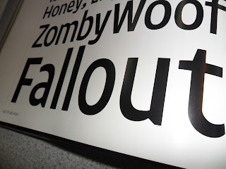
I went through photographing specific type designs that stood out to me, also looking for designs that gave off any feeling of "chilled" or "laid back"

Indie Fonts -


I have taken inspiration from a range of designs from this book for example the way the type designs have a flowing curved face that is then combined with the straight angular Stem.


The same shown here again however this is not as effective in my opinion as there is a separation between the two parts of the letterform. 


My main inspiration was the Bauhaus style along with the Russian constructivist style. 
I feel the combination of sharp angular lines and round curved bowls give the design a real clean finish and to me reflect the message I was aiming to put across to the viewer.


I have taken a lot of inspiration form the designs I have picked out. I will take aspects/styles from each of the designs, and then develop my own ideas around them. 

The International Review Of Graphic Design -


Clean layout with right alignment increases the levels of readability and legibility.


High contrast between the background colour and the typeface colour again increases readability and legibility, these are all key features in creating a design that is easy to read and wont confuse in any way.


Again here are some more typographic design I have found in the process of research, I have again taken key elements of these designs and attempted to replicate in some cases aspects of these designs in my initial design ideas.

Typographic designs found on the Internet that have inspired my designs:


My two main inspiration for this task where designs in the bauhaus style or in the style of the Russian constructivist movement, the main reason for this is down to the way there is a combination of straight angular lines, and curved forms within the russian constructivist movement. I believe In specific designs this gives off a beautifully clean feel, in some cases the designs look laid back. I have come to the conclusion that I can piece this into my designs, by creating a straight angular piece that is the basis for an italic letterform Inspired by russian constructivism. I will then introduce the smooth curved forms common in Bauhaus designs. Hopefully creating a typeface that is not only visually appealing, Readable and legible but also carries the message of laid back and chilled.