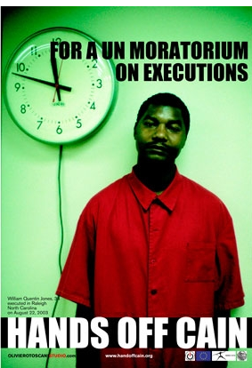
I have decided to look at the work of Olivero Toscanni, i have moved away from just looking at the advertising side of his portfolio and am now looking at some of the personal work i love how emotion can be communicated through an image. For example the image as seen below the black and white image to me reflects pain and suffering rather than the introduction of typographic elements telling you i feel that in some way image is without doubt more powerful that words so i feel having a strongly image based design will be more effective.
as you can see below he is very well known for using figures that are controversial and will without doubt shock the audience i feel this is a very effective aspect and art direction, i will be using this as inspiration throughout my poster campaign as i feel this is what makes the designs stand out. However i again feel you must be careful as to what images are included as it could back fire and offend the audience.
The image below is again a great example of how the striking images can create an amazing design there is no need for typographic elements with the design below as the image does all the talking the suffering is communicated instantly and has much more of an effect that the words "Oil Spill" again this is something i want to integrate into my design.
The design above and to the right shows how typographic elements juxtaposed with image can work really effectively this has to be subtle in my opinion i have found from research that image works best with a white typographic element over the top however this must be subtle typographic elements and must not overpower also this must only be applied on a dark are of an image or the type becomes useless as it is then un readable.
The use of Props can be effective in giving a campaign or multiple images a brand or making them a set. as you can see with the image above this design is part of a set, that features these masks in a range of different images, for my campaign i aim to do this with the introduction of a cardboard box typographic elements will be written on this and will feature in all of my images making the campaign flow as one.
The rest of the images below are taken directly from OLIVIEROTOSCANISTUDIO and i feel display again, how striking images can be if the content is out of the ordinary and different and i feel this is what will make my poster designs stand out. The public never really pay attention to the homeless if anytime its donating a little change, the public are in some cases scared of them. i want my design to stand out and allow the public to look into the lives of the homeless it sounds like a lot but i feel the emotion of the homeless person i work with will communicate a lot.


No comments:
Post a Comment