We where set a brief that was to create a typeface, that reflected the personality and character of our partner. I discovered this by a series of questions we then selected the answers which best described my partner.
The two words I ended up with are:
- Laid back
- Chilled
I decided I would then look for some existing typography designs, I selected two books called:
- Indie Fonts
- The International Review Of Graphic Design
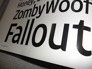
I went through photographing specific type designs that stood out to me, also looking for designs that gave off any feeling of "chilled" or "laid back"
Indie Fonts -
I have taken inspiration from a range of designs from this book for example the way the type designs have a flowing curved face that is then combined with the straight angular Stem.
The same shown here again however this is not as effective in my opinion as there is a separation between the two parts of the letterform.
My main inspiration was the Bauhaus style along with the Russian constructivist style.
I feel the combination of sharp angular lines and round curved bowls give the design a real clean finish and to me reflect the message I was aiming to put across to the viewer.
I have taken a lot of inspiration form the designs I have picked out. I will take aspects/styles from each of the designs, and then develop my own ideas around them.
The International Review Of Graphic Design -
Clean layout with right alignment increases the levels of readability and legibility.
High contrast between the background colour and the typeface colour again increases readability and legibility, these are all key features in creating a design that is easy to read and wont confuse in any way.
Again here are some more typographic design I have found in the process of research, I have again taken key elements of these designs and attempted to replicate in some cases aspects of these designs in my initial design ideas.
Typographic designs found on the Internet that have inspired my designs:
My two main inspiration for this task where designs in the bauhaus style or in the style of the Russian constructivist movement, the main reason for this is down to the way there is a combination of straight angular lines, and curved forms within the russian constructivist movement. I believe In specific designs this gives off a beautifully clean feel, in some cases the designs look laid back. I have come to the conclusion that I can piece this into my designs, by creating a straight angular piece that is the basis for an italic letterform Inspired by russian constructivism. I will then introduce the smooth curved forms common in Bauhaus designs. Hopefully creating a typeface that is not only visually appealing, Readable and legible but also carries the message of laid back and chilled.


No comments:
Post a Comment