I decided to look at existing designs to gain inspiration for my design i have looked at a range of print finishes that i feel are aesthetically pleasing and that i feel would be effective introductions to my print production manual.
De bossing_
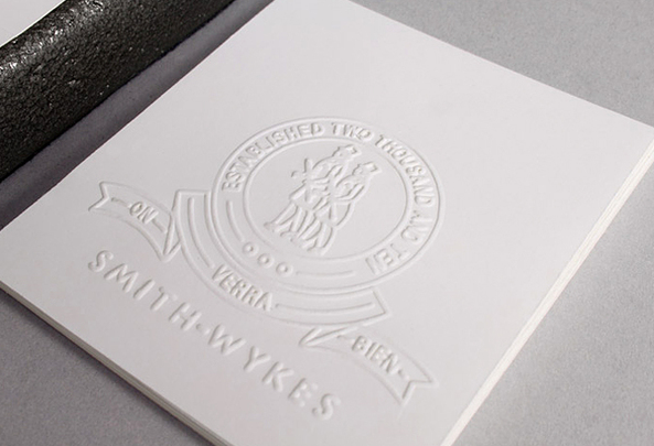
this is one of my favourite print finishes, the finish if executed well is beautiful and gives a design a high quality finish, this is something that i will definitely be experimenting with, i love the finish that is shown below which is a Blind De boss, this is basically an de boss that consists of no ink the design is just pressed into the substrate.
I have found from visual research that the highest quality emboss and de boss are achieved using a thick pulp stock, this is definitely something that i will be taking into consideration, when i pursue my embossing and de boss experimentations.
The image below shows a beautiful emboss, as you can see the substrate used is a very thick pulp stock that obviously holds a very high quality emboss, In my opinion this instantly gives a design an expensive luxurious feel, as my Print production manual is a one off this is what i want the design to have an elegant luxurious finish.
I normally don't really enjoy introducing lots of colour to my designs however spot colour is something that really appeals to me. The use of a spot colour is beautiful in achieving a vibrant colour that stands out. This is definitely something that i will be introducing to my design, although i do not have the funds to actually have this printed, I will re create this effect by using the screen print process.
In terms of inspiration for layout design i feel that the most effective approach to go with the modernist layout i feel that this is most effective method as there is a large amount of content going into the manual the use of white space and a strict grid system will ensure that the typographic elements do not over power. The example below shows how a modernist layout can use white space to create a modern clean looking design and in my opinion the use of the 2 colour print gives a beautiful clean finish.
Again the design below shows black text, in combination with a spot colour in my opinion this is very professional looking and is something that i will definitely be looking into when generating my design development.


No comments:
Post a Comment